


Flow Homescreen
4.5229.00 Reviews
App Specs
- Version
- 1.2.6
- Updated On
- License
- Free
- Downloads
- 50,000+
- Developer
- Build4world
- Categories
- Personalization
- Platform
- Android
Screenshots
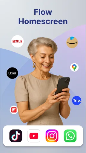
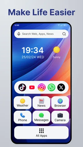
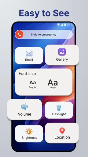
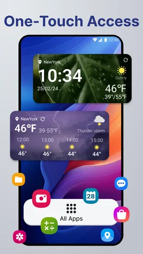
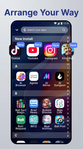
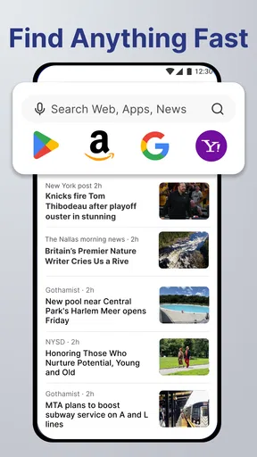
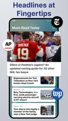
 Analysis by AppCompare
I spent time using Flow Homescreen as a daily Android launcher rather than treating it like a quick visual makeover. That distinction matters because its appeal is less about adding decoration and more about changing the first few seconds of every phone session. Instead of opening the usual crowded grid and reacting to whatever catches my eye, I found myself approaching the home screen as a short route to the things I actually repeat.
Flow Homescreen is a free personalization app from Build4world, aimed at people who want a cleaner, more deliberate starting point on Android. It supports devices running Android 8.0 or later, carries an Everyone age rating, and is currently at version 1.2.6. The app has reached over 50 thousand installs and holds a 4.5 average from around one thousand ratings, which gives it a useful level of real-world attention without making it feel like an unavoidable mainstream default.
My overall impression is positive, with one important qualification: this is most rewarding when I am willing to adjust my habits along with the layout. If I only want a new wallpaper or a more colorful icon arrangement, a conventional launcher may feel easier. If I want my home screen to reduce visual noise and guide me toward repeatable actions, this app has a clearer purpose.
Building a baseline workflow instead of another app drawer
The best way to approach Flow Homescreen is to begin with the way I actually use my phone. I did not start by trying to make every application available from the first screen. I first identified the actions I perform repeatedly: checking messages, opening a browser, handling calls, viewing a calendar, and reaching settings when something needs changing. That made the home screen feel like a working surface rather than a storage shelf.
This baseline is important because personalization can easily become another form of clutter. A launcher gives me the freedom to arrange things, but freedom without a plan usually produces several rows of icons, multiple folders, and a search for the one item I wanted in the first place. With Flow Homescreen, I got better results by keeping the starting arrangement intentionally narrow and allowing less frequent apps to remain one step away.
In a realistic morning routine, I can unlock the phone, go directly to the information I need, and then leave the screen without wandering through unrelated apps. The benefit is not that any individual tap becomes magical. The benefit is that the visual decision has already been made. I am less likely to open a social app simply because its icon is prominent beside the tool I meant to use.
That makes the app particularly suitable for people who feel their current launcher encourages impulsive checking. It is also a good fit for a spare device, a work phone, or a personal phone where the owner wants a calm, repeatable starting point. Someone who enjoys constantly reorganizing icons may find the experience less satisfying, because the strongest result comes from settling on a structure and using it consistently.
Worth Reading Before You Choose

EA SPORTS FC Mobile 26 Is a Bigger Football Game, but It Takes Time

Flipboard Shows What News Apps Must Do Beyond the Feed
Switching to Android Auto Means Rethinking Your Driving Routine
Google Calendar Makes a Crowded Week Easier to Manage

Ludo King Makes the Most of the Minutes Between Plans

Baby Panda World Brings Quick Play to Modern Phones, but Its Game Library Feels Busy
What I would set up first
I recommend creating a simple baseline with only the actions that support the day’s common loops. For me, that means communication, navigation, browsing, and planning rather than every entertainment app. I then use the same placement repeatedly instead of moving items whenever the mood changes. This sounds basic, but consistency is what turns a personalized screen into a shortcut for memory.
A useful test is to ask what I would reach for while standing in a queue, walking between meetings, or trying to leave the house. Those situations expose whether the layout is genuinely efficient. If an app is used only occasionally, putting it on the first screen may make the whole arrangement harder to read. Flow Homescreen works best when the first screen answers frequent needs and leaves rare tasks out of the main visual field.
I also found it helpful to separate “things I need to do” from “things I might browse.” A messaging tool or map can support a clear task, while a feed-based app can easily turn a short check into a longer session. Keeping those categories visually distinct is one of the more practical ways to use a personalization tool for focus without pretending the launcher itself can control my self-discipline.
Who benefits from the change
People moving from a busy default launcher will notice the biggest difference. The app gives a more purposeful feel to the starting screen, especially when the phone has accumulated years of downloads. New Android users may also appreciate having a chance to establish a system before the default arrangement becomes automatic.
On the other hand, I would not choose it for someone who depends heavily on a manufacturer’s launcher-specific tools or wants a very elaborate visual theme. Flow Homescreen is better judged by how quickly it helps me reach recurring actions than by how many decorative options it can provide. Users who want deep customization of every icon, animation, and panel should compare it with a more feature-heavy launcher before switching.
Settings worth checking before judging the experience
The first setup should not be rushed. I would spend a few minutes checking how the home screen behaves, how items are arranged, and which parts of the interface I expect to use every day. A launcher can feel awkward simply because its initial arrangement does not match the owner’s routine. That is not necessarily a flaw in the app, but it is a reason to evaluate it after a normal day rather than after a single glance.
My practical approach is to change one group of decisions at a time. I first establish the main destinations, then test the layout during ordinary use, and only afterward refine the less frequent items. This prevents the common mistake of changing everything at once and losing track of which adjustment made the screen better or worse.
It is also worth checking the app’s role as the active home experience on the device. Android can make launcher changes feel more complicated than they need to be, especially when the phone has a manufacturer interface with its own home-screen behavior. If the phone keeps returning to the previous launcher, I would check the system’s default home-app setting rather than assuming Flow Homescreen is malfunctioning.
Another useful check is whether the arrangement remains comfortable with one hand. A layout that looks balanced while holding the phone at a desk may be less convenient while walking or carrying something. I prefer placing the actions I use under pressure where my thumb can reach them naturally, then leaving visual space around them. The goal is not to fill the screen; it is to make the important route obvious.
Small choices that prevent later friction
I avoid placing too many destinations at the same visual level. When everything appears equally important, nothing is prioritized. A small central group is easier to remember than a dense collection of nearly identical choices. This is one of the less obvious advantages of treating the launcher as a workflow tool: organization becomes a way to reduce hesitation, not merely a way to make the screen look tidy.
I also recommend testing what happens after installing a new app. New downloads can tempt me to expand the home screen immediately, even when the app is experimental or rarely used. My rule is to give a new app time to prove that it belongs in the main route. Otherwise, the launcher slowly returns to the same clutter it was meant to replace.
For a shared or family phone, I would keep the structure especially plain. An arrangement that makes sense only to its creator can confuse someone else. Flow Homescreen is more approachable when the visible choices have familiar purposes and the layout does not depend on remembering a complicated personal code.
How the current release fits into daily use
Version 1.2.6 feels like a release I would evaluate for stability in my own routine rather than assume it will solve every Android-specific difference. Devices can handle home-screen replacements differently, and the experience may depend on the phone’s existing software. I would therefore test calls, notifications, app switching, and returning home before committing to it as my permanent setup.
The app is free, which removes the biggest barrier to trying that experiment. I can judge it on the quality of the workflow instead of worrying about paying before I know whether the arrangement suits me. The Everyone rating also makes it broadly approachable, although ease of use still depends on how comfortable the individual is with changing a familiar Android habit.
Faster patterns that make the home screen earn its place
Once the baseline is stable, the next improvement comes from repetition. I try to make the same action follow the same visual path every time. If I always open planning from one location and communication from another, my hand begins to move before I consciously search. That is where Flow Homescreen becomes more than a cosmetic replacement: it can support a small set of reliable patterns.
One pattern I like is the “start and finish” arrangement. I place the tools used to begin the day together, such as planning and communication, while keeping distracting options outside that immediate group. Later, I can reverse the emphasis if my evening routine has different needs. The useful insight is not to create separate screens for every situation, but to design one starting point around the actions that matter most during the day.
A second pattern is to use folders sparingly. Folders are helpful for low-frequency categories, but they can hide items I need under time pressure. I use them for collections that are naturally grouped and infrequently opened, while keeping high-frequency actions visible. This trade-off is easy to miss: a tidy folder can look efficient while adding a memory step to every use.
A third pattern is to treat search as a fallback rather than the main workflow. Search is valuable when I need an unfamiliar app, but relying on it for everything means the home screen has not been organized around my real behavior. I want the first screen to handle predictable tasks quickly and search to handle exceptions.
A practical routine for reducing distraction
When I need to focus, I remove visual invitations rather than making a dramatic promise to use the phone less. I keep task-oriented tools easy to reach and move entertainment or curiosity-driven apps away from the immediate starting area. This does not block access, and that is precisely why it feels realistic. I am changing the path of least resistance, not pretending the apps no longer exist.
For example, if I am preparing to leave home, I can make navigation and communication prominent while avoiding a layout that places several feed-based apps beside them. After the trip, the same arrangement still works because the tools remain useful. The advantage is subtle but practical: the screen supports the intention I already have instead of competing with it.
I also recommend using a short observation period before making another redesign. If I move something after every awkward tap, I never learn whether the original placement would have become familiar. I would rather note the friction, use the layout for a while, and then make one deliberate change. This approach is especially helpful for people who are switching from a dense default launcher and initially feel that the simpler screen is “missing” something.
How it compares with familiar launcher alternatives
Compared with the standard launcher supplied with an Android phone, Flow Homescreen is appealing when the default arrangement feels too busy or too tied to the manufacturer’s visual style. The usual launcher often provides a familiar app grid and broad compatibility with the phone’s existing conventions. That can be the better choice for someone who wants zero adjustment or relies on device-specific panels.
Compared with highly customizable third-party launchers, Flow Homescreen is easier to appreciate as a focused alternative rather than a universal replacement. A feature-rich launcher may be preferable for users who want extensive icon packs, elaborate gestures, detailed animation controls, or a large number of layout options. Flow Homescreen makes more sense for me when I value a clean route over an endless configuration project.
There is also a trade-off against staying with the default home screen and simply deleting unused icons. Manual cleanup can be enough for someone whose main problem is clutter. Flow Homescreen becomes more worthwhile when the owner wants to rethink the starting experience itself and build a repeatable arrangement around daily actions.
Advanced limits and the point where I would choose something else
The app’s focused character is also its main limitation. A simpler home screen cannot compensate for every problem created by notifications, habits, or an overfilled app collection. If I continue responding to every alert and opening every distracting app through search, the launcher has only changed the scenery. Its value depends on whether I use the structure as a prompt for better choices.
I would also be cautious if my phone use depends on specialized launcher behavior. People who need extensive automation, complex gesture systems, unusual widget arrangements, or a highly customized visual identity may reach the limits of a focused launcher quickly. In that situation, a more configurable alternative may be worth the additional setup time.
Another limitation is that a minimalist arrangement can hide useful context. Some users prefer seeing a broad overview of widgets, reminders, weather, or upcoming information immediately. If that glanceable dashboard is central to the way I work, I would compare Flow Homescreen carefully with a launcher built around information density. A clean screen is not automatically a productive screen for every person.
I would also avoid switching just because the app has a strong rating. Its 4.5 average and roughly one thousand ratings suggest that many users enjoy the experience, but a rating cannot decide whether its workflow suits my phone or my habits. I would install it because I want a calmer starting point, then judge it by repeated use rather than by the number attached to the listing.
Questions I would answer before keeping it
Is it suitable for an older Android phone? The minimum requirement is Android 8.0, so devices on that version or newer can be considered. Still, I would test the actual phone after installation, because the feel of a launcher depends on the device’s existing software and how smoothly the home screen returns after opening other apps.
Will it replace every part of the phone interface? I would think of it primarily as a home-screen experience, not as a replacement for the phone’s entire operating system. Calls, notifications, system settings, and manufacturer-specific behavior still belong to Android and the device. That distinction helps set realistic expectations before making it the default.
Can it help me stop wasting time? It can make distracting apps less visually immediate and make intended actions easier to repeat, but it is not a complete digital-wellbeing system. The strongest results come from combining the layout with a personal rule about which apps deserve first-screen access. Without that rule, the arrangement can gradually become crowded again.
Is the free price enough reason to switch? It makes trying the app straightforward, but not every free launcher is a good fit for every user. I would give it a fair trial during normal workdays and weekends, because a layout that works for a quiet day may fail when I need rapid access to travel, messages, or unfamiliar tools.
Who should skip it? I would skip it if I mainly want a highly decorative setup, deep system-level customization, or a home screen packed with live information. I would also stay with the default launcher if my current arrangement already feels fast and clear. Changing a familiar system has a cost, and Flow Homescreen is most useful when that change addresses a real problem.
My verdict after making the workflow habitual
Flow Homescreen succeeds when I stop treating the phone’s first screen as a display cabinet. Its strongest idea is practical: organize the starting point around repeated actions, then let familiarity do some of the work. I found that a restrained arrangement made ordinary tasks feel more intentional, particularly when I resisted the urge to add every newly installed app to the front.
The experience is not completely frictionless. I need to spend time deciding what belongs in the main route, and I have to accept that some advanced users will want more control than this focused approach provides. The app also cannot solve distraction by itself. It changes access and emphasis; the rest still depends on how I use the phone.
For me, the best audience is someone who looks at a crowded Android home screen and feels that it encourages too many automatic detours. It is also a sensible free experiment for anyone setting up a simpler work phone or trying to make a personal device easier to navigate. Build4world has positioned it in the personalization space, but I think its real appeal is behavioral: the layout becomes a small daily system, not just a new coat of paint.
I would recommend Flow Homescreen to a friend who values calm access, repeatable placement, and a home screen that reflects actual priorities. I would not recommend it blindly to someone seeking the deepest possible customization. After using it as a routine rather than a novelty, my conclusion is clear: it is worth trying when reducing friction matters more than adding features, especially because the free price makes that decision easy and reversible.
Pros
- Minimalist layout keeps essential apps and information easy to reach.
- Customizable widgets let you tailor the home screen to your routine.
- Focus on intentional app access can reduce mindless scrolling.
- Clean design looks modern and avoids visual clutter.
- Useful for users who want a calmer alternative to standard launchers.
Cons
- Some advanced customization options may require a subscription.
- The minimalist layout can feel restrictive for power users.
- Setup takes time if you want to organize apps and shortcuts carefully.
- Users may miss familiar launcher features and conventional app drawers.
- Performance and battery use can vary depending on enabled widgets.
FAQs for Flow Homescreen
What is Flow Homescreen and how does it work?
Flow Homescreen is an Android home-screen replacement designed to make accessing apps, contacts, and daily information more organized. After installation, it replaces the standard launcher and lets you arrange shortcuts, widgets, wallpapers, and other elements according to your preferences. Its usefulness depends on how much customization you want, since changing the launcher can noticeably alter the way you navigate your phone.
Is Flow Homescreen compatible with every Android device?
Flow Homescreen may work on many Android phones, but compatibility can vary depending on the Android version, manufacturer interface, screen size, and device-specific restrictions. Some features may also behave differently on Samsung, Xiaomi, Huawei, or other customized systems. Before downloading, check the app’s Google Play listing for supported versions and read recent user feedback, especially if your phone uses an unusual launcher or heavily modified Android software.
Will Flow Homescreen replace my current launcher and can I switch back?
When configured as the default launcher, Flow Homescreen replaces the home screen you normally use, including the app drawer and shortcut layout. You can generally return to your previous launcher through Android’s default-app settings or by uninstalling Flow Homescreen. It is a good idea to remember your original launcher settings and back up important home-screen arrangements before experimenting with a new interface.
Does Flow Homescreen affect battery life or phone performance?
A launcher usually runs continuously because it controls the home screen, so its resource usage can have a small effect on battery life and performance. On modern devices, the impact is often modest, but animations, live elements, widgets, and background services may increase consumption. If you notice delays, overheating, or faster battery drain after installation, reduce visual effects, remove unnecessary widgets, or switch back to the system launcher.
Is Flow Homescreen free, and are there privacy concerns to consider?
The availability of free features, optional upgrades, advertisements, or in-app purchases can depend on the version offered in your region. Because a launcher may request access to apps, contacts, notifications, or other phone functions, review its permissions carefully before granting them. Download Flow Homescreen from a trusted official store, inspect the developer’s privacy policy, and avoid enabling permissions that do not seem necessary for the features you intend to use.


